Risk and return for B3
The mean-variance map
One of the subjects that I teach in my undergraduate finance class is the relationship between risk and expected returns. In short, the riskier the investment, more returns should be expected by the investor. It is not a difficult argument to make. All that you need to understand is to remember that people are not naive in financial markets. Whenever they make a big gamble, the rewards should also be large. Rational investors, on theory, would not invest in risky stocks that are likelly to yield low returns.
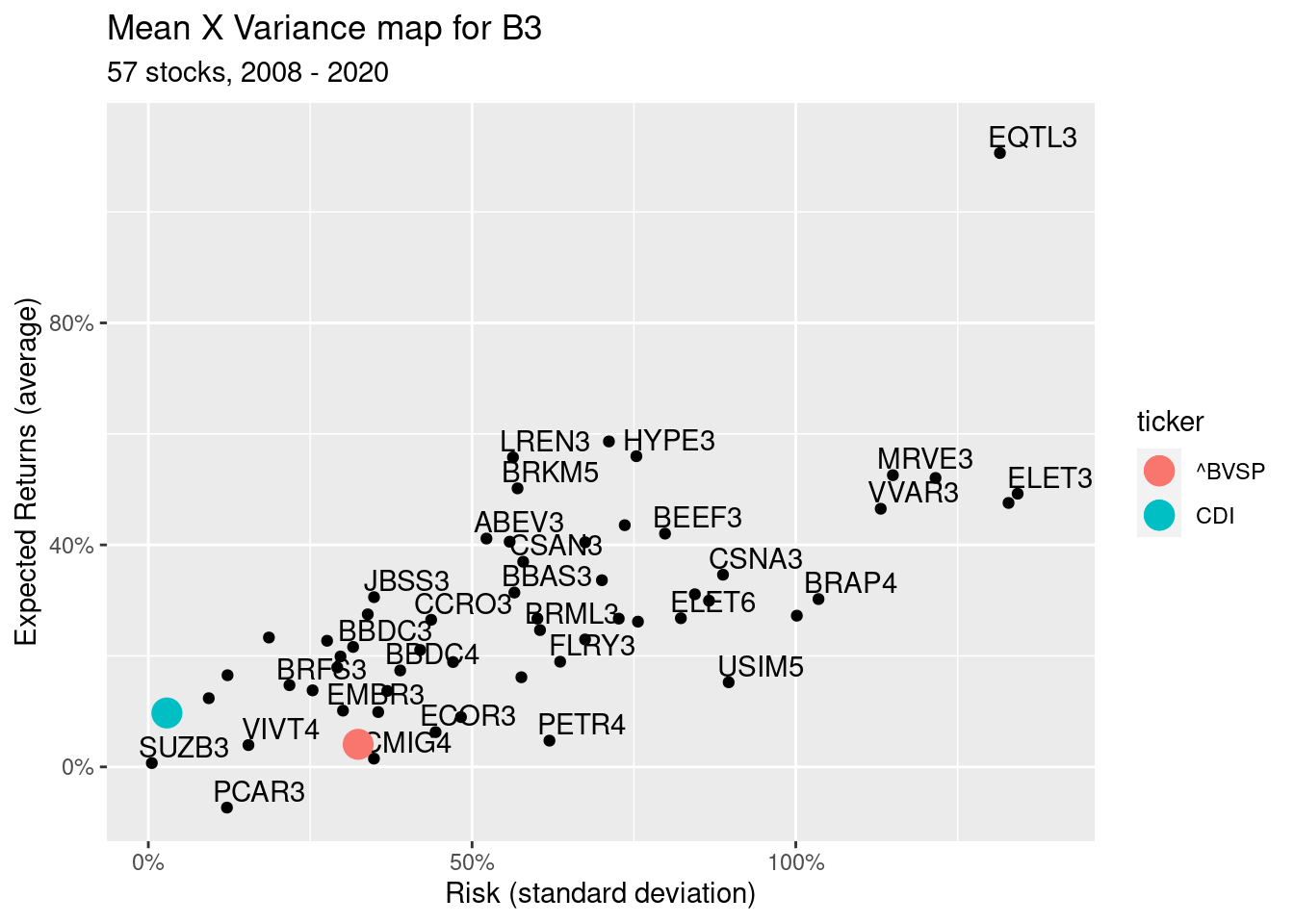
Going further, one the arguments I make to support this idea is looking at historical data. By assuming that expected returns is the average yearly return rate on a stock and the risk is the standard deviation of the same returns, we can check for a positive relationship by plotting the data in a scatter plot.
In this post I’ll show how you can do it easily in R using BatchGetSymbols, GetBCBData and tidyverse.
First, we will gather and organize all data sets. Here I’m using the stock components of Ibovespa, the Brazilian market index, and also CDI, a common risk free rate in Brazil. The next code will:
- Import the data
- organize it in the same structure (same columns)
- bind it all together
# get stock data
library(tidyverse)
library(BatchGetSymbols)
library(GetBCBData)

first.date <- '2008-01-01' # last date is Sys.Date by default

# get stock data
df.ibov <- GetIbovStocks()
mkt.idx <- c('^BVSP')
my.tickers <- c(mkt.idx, paste0(df.ibov$tickers, '.SA') )

df.prices <- BatchGetSymbols(tickers = my.tickers, first.date = first.date,
                             freq.data = 'yearly',
                             be.quiet = TRUE)[[2]]

tab.stocks <- df.prices %>%
  na.omit() %>%
  group_by(ticker) %>%
  summarise(mean.ret = mean(ret.adjusted.prices),
            sd.ret = sd(ret.adjusted.prices)) %>%
  mutate(ticker = str_replace_all(ticker, fixed('.SA'), '') )

tab.mkt.idx <- tab.stocks %>%
               filter(ticker %in% mkt.idx)

tab.stocks <- tab.stocks %>%
               filter(!(ticker %in% mkt.idx))

# get CDI (risk free rate)
my.id <- c(CDI = 4389)

tab.CDI <- gbcbd_get_series(my.id, first.date = first.date) %>%
  rename(ticker = series.name ) %>%
  mutate(ref.date = format(ref.date, '%Y'),
         value = value/100) %>%
  group_by(ref.date, ticker) %>%
  summarise(ret = mean(value)) %>%
  group_by(ticker) %>%
  summarise(mean.ret = mean(ret),
            sd.ret = sd(ret))
Now that we have the data, lets use ggplot to build our graph.
library(ggplot2)

p <- ggplot(tab.stocks, aes(x = sd.ret, y = mean.ret, group = ticker)) +
  geom_point() +
  geom_text(data = tab.stocks, aes(x = sd.ret, y = mean.ret, label = ticker), nudge_y = 0.03,
            check_overlap = TRUE, nudge_x = 0.05 ) +
  geom_point(data = tab.CDI, aes(x = sd.ret, y = mean.ret, color = ticker), size =5) +
  geom_point(data = tab.mkt.idx,
             aes(x = sd.ret, y = mean.ret, color = ticker), size =5) +
  labs(x = 'Risk (standard deviation)', y ='Expected Returns (average)',
       title = 'Mean X Variance map for B3',
       subtitle = paste0(nrow(tab.stocks), ' stocks, ', lubridate::year(min(df.prices$ref.date)),
                         ' - ', lubridate::year(max(df.prices$ref.date)))) +
  scale_x_continuous(labels = scales::percent) +
  scale_y_continuous(labels = scales::percent)

print(p)
Looks pretty! What do we learn?
Overall, most of the stocks did better than the risk free rate (CDI);
There is a positive relationship between risk and return. The higher the standard deviation (x-axis), the higher the mean of returns (y-axis). However, notice that it is not a perfect relationship. If we followed the mean-variance gospel, there are lots of opportunities of arbitrage. We would mostly invest in those stocks in the upper-left part of the plot;
Surprisingly, the market index, Ibovespa (^BVSP), is not well positioned in the graph. Since it is a diversified portfolio, I expected it to be closer to the frontier, around stock EQTL3.